
Remember that feeling of anticipation when you know something big is coming? Wiremit, a name that’s become synonymous with money transfers for many in Zimbabwe, recently stirred up that exact excitement on their social media, teasing us with a simple, intriguing question: “WHAT IS NEW?” Well, the wait is over, and what’s new is a vibrant, refreshed identity that signals a bold step forward. This isn’t just a lick of paint; it’s a reflection of Wiremit’s commitment to you, their valued customer, and a future of truly smart money solutions.
From Familiar Roots: Wiremit’s Journey in Zimbabwe
Wiremit has quickly become a recognizable name for many Zimbabweans, both at home and abroad, looking to send and receive money. While the corporate structure might have seen some evolution, the active “WIREMIT LIMITED” has certainly made its mark.
Our journey with Wiremit in Zimbabwe likely began around July 2023, when they officially launched their services, stepping into a bustling market filled with the critical need for seamless money movement. From the outset, Wiremit has been recognized by the Reserve Bank of Zimbabwe (RBZ) as an Authorised Dealer with Limited Authority (ADLA), a testament to their commitment to operating within regulatory frameworks and ensuring secure transactions.
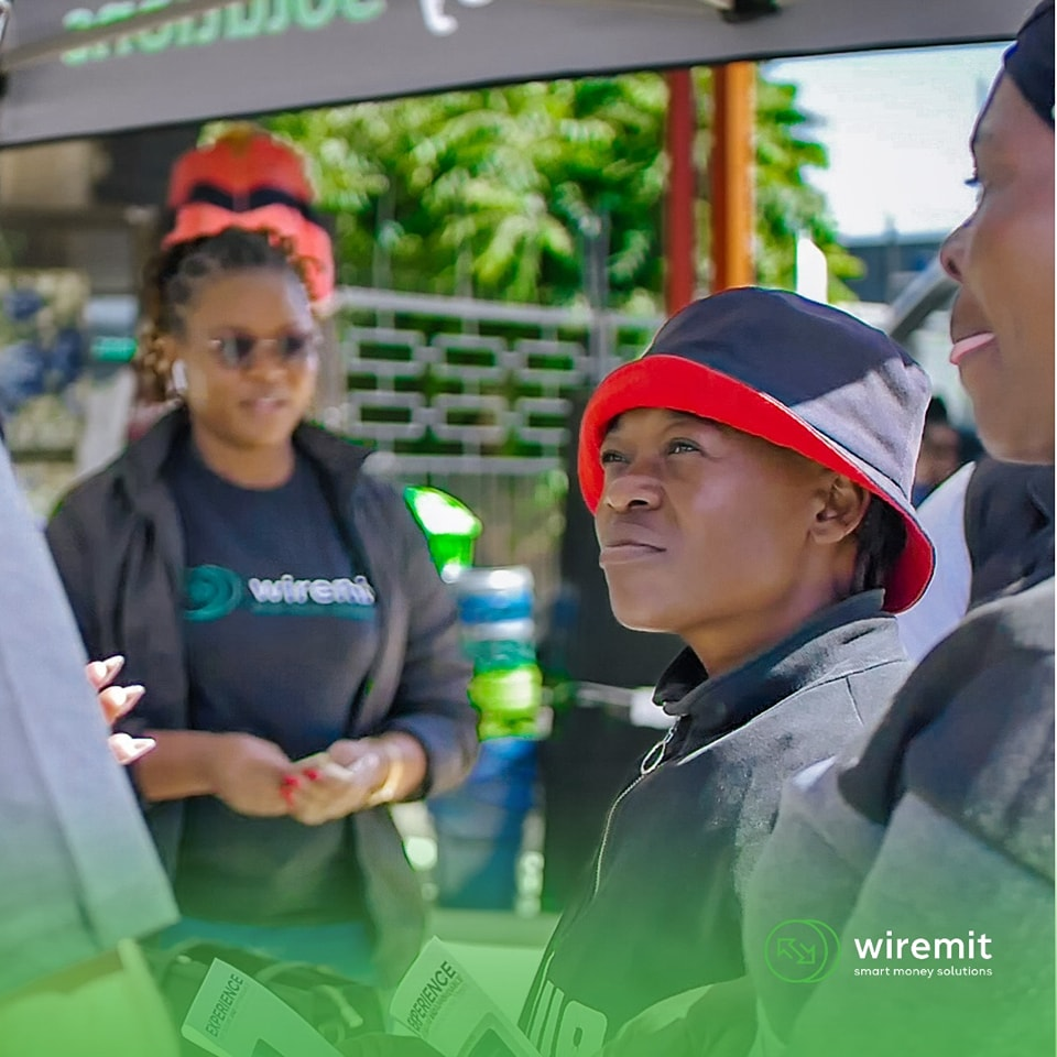
You’ve probably seen their branches, or perhaps heard about them through word-of-mouth – they’ve established a physical presence in key locations across Zimbabwe, including Harare (Joina City, Mashwede Highglen, Chicken Mash Mbare, Chicken Mash Makoni), Gweru, Kwekwe, Bulawayo, Beitbridge, and Mutare. This physical footprint, combined with their digital aspirations, shows their dedication to serving communities directly. Beyond just transfers, Wiremit also offers bureau de change services, handling currencies like EUR, GBP, ZAR, and USD, and even boasts competitive South Africa EFT services, making them a comprehensive financial solution for many.
The Big Reveal: A Brand Identity That Speaks Volumes
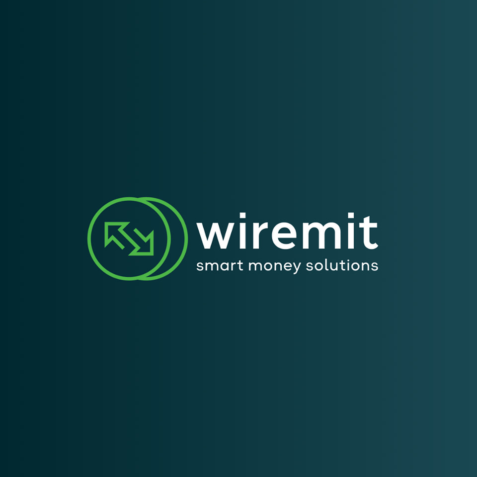
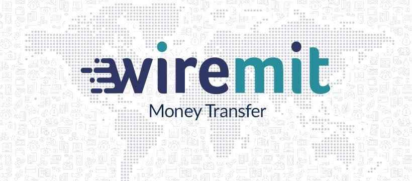
The moment you “swipe to find out” what’s new, you’re greeted with Wiremit’s transformed brand identity. Gone is the old logo’s blue “wire” and teal “mit” with the subtle world map background, which, while clear about its purpose, felt a bit more traditional.
The new design, as Wiremit themselves proudly states, “symbolizes reliability, speed, and modernity—key aspects of our company.” It features a vibrant green circular icon with two overlapping arrows that beautifully tell a story. These arrows aren’t just decorative; they represent the core of what Wiremit does: the effortless flow of money, the exchange, and the vital connection between sender and receiver, regardless of where they are. The circular shape itself often implies global reach, completeness, and a continuous, reliable service. The clean, sans-serif font for “wiremit,” all in white against a dark teal/blue background, truly exudes professionalism and a forward-thinking attitude.
Our New Brand Colors: More Than Just Hues
Wiremit hasn’t just changed its logo; they’ve thought deeply about the very colors that represent them. The new palette features a minimalist style with clean lines and contemporary colors, highlighting their dedication to “simplicity and efficiency.” Each color chosen carries a specific meaning, adding depth to their brand message:
- Green: This vibrant hue isn’t just about money; it symbolizes Loyalty, Stability, and Rebirth. It speaks to growth, freshness, and a trusted partnership.
- Blue: The deep, solid blue embodies Trust, Security, and Credibility. These are non-negotiables when it comes to your money, and Wiremit wants you to feel that assurance.
- White: This clean, crisp color represents Balance and Transparency. It’s about clarity, honesty, and making sure everything is straightforward for you.
This thoughtful selection of colors reinforces their commitment to a reliable, secure, and clear financial experience.
Stepping into the Digital Future: Website & Mobile App
The rebrand isn’t just about looking good; it’s about doing better for you. Wiremit is making it easier than ever to manage your money transfers with their updated digital platforms:
- Website (Wiremit.money): You can now effortlessly check for the latest updates, compare rates, and most importantly, send money directly via their sleek new website. It’s designed for convenience, bringing the power of money transfer right to your fingertips, wherever you are.
- Mobile App: For those on the go, Wiremit has launched a new, user-friendly mobile application. This app promises not just access to the latest rates, but also exciting discounts and referral programs. It’s available for both Android users on Google Play and Apple users on the App Store, ensuring everyone can benefit from this seamless, smart money solution experience.
Why This Matters: It’s About You.
This comprehensive rebranding effort is a testament to Wiremit’s commitment to growth, innovation, and, most importantly, meeting your evolving needs. In a world where financial services are becoming increasingly digital and interconnected, a brand’s visual identity and its underlying services need to resonate with modern expectations of efficiency, security, and accessibility.
The move towards a more abstract, dynamic logo, much like Mukuru’s transition from its distinctive cow icon to a modern starburst, signifies a desire to be seen as a global player, adaptable to diverse markets and sophisticated financial landscapes. It’s about projecting an image that’s timeless, trustworthy, and ready for the future.
For you, the customer, this rebrand means Wiremit is continually striving to enhance your experience. It suggests a focus on innovative solutions, a dedication to staying ahead of the curve, and a commitment to making your money transfers as seamless and secure as possible. It’s a promise of “smart money solutions” that are designed with your needs in mind, empowering you with loyalty, trust, and transparency in every transaction.
In essence, Wiremit’s new look is a confident statement: they’re here to stay, to innovate, and to continue bridging distances through reliable and ever-smarter money transfer services. It’s an exciting chapter for a company deeply rooted in facilitating connections for Zimbabweans, both at home and across the globe.